Jakob Nielsen recently posted an article urging designers to stop masking passwords on websites. Password masking means showing dots or asterisks instead of the actual password when you are typing it into a web form. Here’s the summary of Nielsen’s argument:
Usability suffers when users type in passwords and the only feedback they get is a row of bullets. Typically, masking passwords doesn’t even increase security, but it does cost you business due to login failures.
An easier login form
Nielsen’s article sparked some controversy in the interaction design circles. It also made me think about other aspects of login forms that could be improved, and here’s what I came up with:
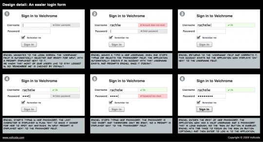
- Use input prompts to tell users what to type into a text field. Input prompts can improve most forms and you should apply them generously.
- Use real-time validation to help users type their input in the correct format and let them know immediately about any potential errors.
- Use real-time validation for username to check that the user account exists.
- Disable submit button until user has completed all required fields. Do this in conjunction with real-time validation to ensure correct input.
- Use good defaults so that users can complete the form in as few interactions as possible.
Let’s have a look at Twitter’s Signup screen for inspiration and put the above improvements into practice. Here’s my design sketch of an easier login form:
Obviously this approach won’t work for applications with very high security requirements, where you don’t want users ‘testing’ which accounts exist and which don’t. However in many web applications users already know each others’ usernames, and the practical level of security is maintained whilst providing a better login user experience.
What do you think of the above design?
How would you simplify it further or otherwise make it even more easy for the users?
In closing
Here’s a great tweet from Robert Hoekman, Jr., the author of Designing the Obvious and Designing the Moment:
From @lorenbaxter: “Which brings up the question, How critical is it that your users log in?” Bravo, Loren. That’s the real debate to have.
So, optimising the design of your login form can improve the user experience tremendously but getting rid of the form altogether might improve it even more!
Further reading
Password masking:
- Jakob Nielsen’s Alertbox, June 23, 2009: Stop Password Masking
- Alan Hogan: Nielsen, Password Masking, and the iPhone
- Decaf: iPhone-like password fields using jQuery – delayed password masking with JavaScript
- ProThemer: New jQuery plugin targeting usability for password masking on forms
Web form guides:
- Smashing Magazine How-To: Web Form Design Patterns: Sign-Up Forms
- Smashing Magazine How-To: Web Form Design Patterns: Sign-Up Forms, Part 2
- Noupe: Beautiful Forms – Design, Style, & make it work with PHP & Ajax
Login form galleries:
- Chris Messina’s Login Forms gallery on Flickr
- Elements of Design: Login Forms Design Showcase with 74 examples
- Dzine Blog: Interface Design Inspiration: 36 Beautiful Login Page/Form Designs

For further reading… here is the login form:
http://tribune.majlab.com/code_examples/mask_password.html
…that has a simple standalone JavaScript solution for masking the password field. No JQuery or other library needed (~500 bytes only)