I recently redesigned the signup process for Naview and thought I’d share some of the thinking behind it.
Original design
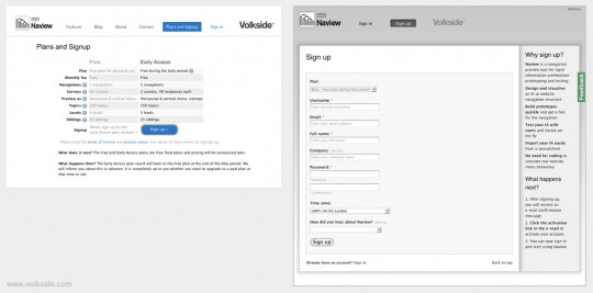
Back in May 2010 the Naview website had a Plans page and a separate sign-up form:
This design worked relatively well but also had a couple of issues:
1. Plan details are only available on the initial Plans and Signup page (above left). Once you click through to the separate Signup page (above right) plan details are no longer visible. Also, on the Signup page it’s also not overly clear which plan you have selected, as this information is only displayed in the drop-down list control (disabled).
2. The two pages look quite different and it may not be obvious that they are part of the same sign up process. There’s a technical reason for this – the Plans and Signup page is served by the website CMS and the Signup page by the application itself – however the experience is certainly not optimal. There’s also some confusion in the page titles (“Plans and Signup” versus “Signup”).
Redesign
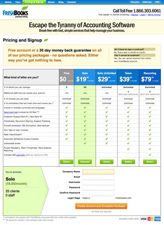
In the redesign I looked at the plan listing and sign-up pages for leading online services like Basecamp, Campaign Monitor, Mailchimp and Tumblr. One of the more innovative ones was Freshbooks:
I really liked the Freshbooks idea of showing the plans table and sign-up form on the same page and borrowed this for Naview.
Curiously enough Freshbooks have since changed their design to a more traditional, separate sign-up page. Also, you can only sign for the Free plan directly and paid plans are only available through a subsequent upgrade.
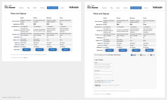
Here’s what the redesigned Naview Plans and Signup page looks like:
In the new version the signup form is not initially visible (above left). Once user clicks Sign up under the selected plan the signup form is displayed inline underneath (above right). Some of the benefits of this approach are:
- It’s clear which plan you have selected. You can see the full details whilst completing the sign-up form.
- You can keep comparing plan details whilst signing up. Want to select another plan instead? No worries, all previous input is retained.
- The sign-up experience is more consistent. Everything happens on the one screen (well, except for the payment) so you always know where you’re at.
- Sign-up now takes place in the context of the website rather than the application – a subtle but important conceptual difference. The Plans and Signup page and the form itself use the website’s visual theme.
There are some other improvements to the Naview signup process, too:
- I minimised the number of input fields on the signup form. In the interest of gradual engagement all non-essential field have been moved to the My Account page, where users are taken to after their first login.
- I added a progress indicator to give the user an idea of what to expect next.
- The Billing details are only shown for paid plans. They are displayed or hidden inline depending on which plan is selected.
Have a look at the new Naview Plans and Signup page here. Overall I feel that the redesigned signup process is more streamlined and an improvement over the original version. What do you think?
Related resources
- Stuff and Nonsense: Prices and plans design patterns by Andy Clarke
- A List Apart: Sign Up Forms Must Die by Luke Wroblewski
- AskTog: How to Achieve Painless Registration by Bruce Tognazzini
- Smashing Magazine: Web Form Design Patterns: Sign-Up Forms by Vitaly Friedman
- Webdesigner Depot: 25 Inspiring Examples of Sign-Up Pages by Liz Fulghum
- Web Designers Blog: 40 Brilliantly Designed Login and Sign Up Web Forms by Sivashankar Kulandaivel


Here’s some feedback on the design I received by email (numbering added):
These are all fair points and I’ll be looking at addressing each in the next revision. Thanks for the comments!