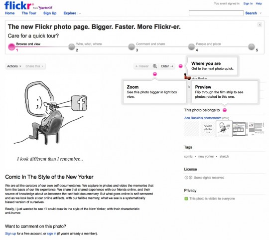
Flickr have redesigned their photo page and their interactive tour of the new layout and features is way nice:
Some quick observations:
- The prompt “Care for a quick tour?” is prominent yet unobtrusive and can be closed easily
- The 5-step progress indicator shows at a glance how quickly you can complete the tour
- Hovering your mouse cursor over each step displays the related annotations and hides them on mouse-out
- Clicking on each step displays the related annotations more permanently and marks that step as ‘done’, subtly prompting you to move on to the next step
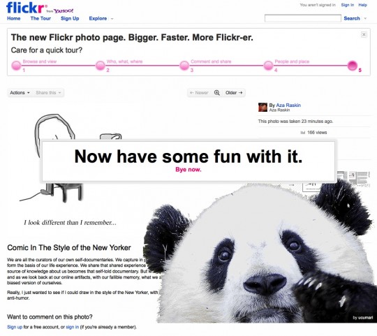
- The last step includes a nice Easter egg style conclusion page with a call to action.
The best thing about this tour is that it takes place over the actual photo page all the while letting you interact with it and learn about the new features in real context.
Talk about a great ramp-up experience!
You can explore the actual photo page here (image credit: Aza Raskin).


This is a great example of my favorite rule of web design: When you don’t know what to say you can always show picture of cute animal. Can get wrong with that! I love Flickr, except the Yahoo’s login screen in between the Flickr-experience….