I have run some card sorting exercises lately to help come up with and revise an information architecture in our clients’ website redesign projects.
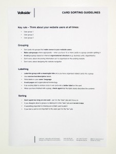
In recent sessions, I have made a poster with “card sorting guidelines” available to the participants. These guidelines serve as a quick reference when the participants are immersed in sorting the cards and remind them of the “do’s” and “don’ts” in grouping and labelling.
Naturally these guidelines are just an aid and you will still need to introduce the overall process, facilitate the session and take notes of the key observations and comments to get good results.
If you want to use the card sorting technique yourself Donna Spencer’s and Todd Warfel’s Card sorting: a definitive guide over at Boxes and Arrows is a must-read. You may also want to have a look at James Robertson’s classic article on Information design using card sorting. Some of the guidelines have been adapted from these sources.
The current take on the card sorting guidelines is posted below. This version is aimed at stakeholders who work in the client organisation and you will need to adapt them slightly when doing card sorting with the general public.
The guidelines are a work in progress but I hope you find them useful!
Key rule – Think about your website users at all times:
- User group 1
- User group 2
- User group 3
Grouping
- Sort cards into groups that make sense to your website users
- Make sub-groups where appropriate – when you have 10 or more cards in a group consider splitting it
- Avoid groupings based on internal organisational structure (e.g. business units, departments)
- Don’t worry about structuring information as it is organised on the existing website
- Don’t worry about designing the website navigation
Labelling
- Label the group with a meaningful title once you have organised related cards into a group
- Use concise but descriptive labels
- Write labels in your users’ language
- Avoid jargon and organisational terminology
- If an existing label is unclear cross it over and write a better label on the card
- When you have finished with a group, check again that the label clearly describes the contents
Sorting
- Don’t spent too long on one card – put it in the “later” pile and move on
- If you disagree about a group or a label put it in the “later” pile and revisit it later
- If something important is missing use a blank card to add it
- If you feel a card is not important to the users put it in the “bin” pile
Can you think of anything that should changed or added based on your card sorting experiences?
