A mate of mine is a massive fan of 1990’s dance music. When I say a massive fan, I mean it – the guy can probably list all of the 90’s eurodance groups off the top of his head, and he even runs an online service called Dancentral, “the ultimate dance music video directory.”
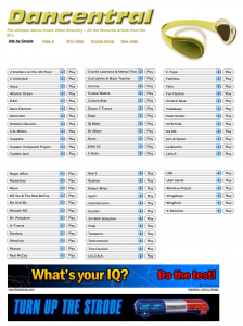
He recently wanted to update the directory and asked me for some advice on the user interface. Here’s what Dancentral looked like at the time:
The activity flow was as follows:
- Locate artist of interest, listed as the first item of each drop-down menu
- Click to open the drop-down menu
- Click to select track
- Click play
- Video opens in a new window
I found this quite cumbersome and started thinking about a different way of accessing the video directory.
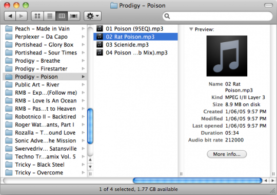
I am a big fan of the “column view” in the Macintosh OSX Finder and quite quickly decided to borrow this proven design for Dancentral:
Luckily for us, Christian Yates had done all the hard work by implementing a jQuery plug-in to turn hierarchical lists into a Finder-like column view.
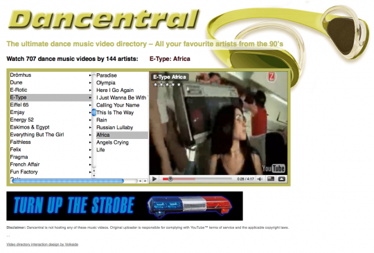
I used Christian’s plug-in as a key part of the redesign. Here’s what the new Dancentral looks like:
The new activity flow goes like this:
- Locate artist of interest in the first column
- Click to display available tracks in the second column
- Click to select track
- The music video starts playing automatically in the embedded player on the same page
Musical tastes and visual design aside, here are some of the benefits of the new interaction design:
- The page offers a better overview of the available artists
- It’s easy to switch between different tracks with a single click
- There’s one less step in the overall activity flow
- The video player is embedded and shown in the immediate context of the currently selected artist and track
The new page is a lot easier to maintain, too. My friend can upload the track list as a text file, which helps him manage the 700+ music videos available on Dancentral. There may be some search engine optimisation benefits as well, now that the tracks are listed as list items rather than being bundled inside drop-down lists.
Go have a look at Dancentral, “the ultimate dance music video directory!”
What do you think of the redesign? Are there ways to streamline the activity flow further?


I’ve been watching & listening 90’s hits now for ~an hour, so I guess it means this is working… =)