Update 17 May 2009: The Volkside website has been redesigned since this post was written but the input prompt behaviour is still applied.
Key function on any business website is the ability to contact the company. Several pages on the Volkside website lead you to the contact information page, and having prospective customers get in contact with us is indeed the main “call to action” on this site.
The contact information page itself offers multiple ways of reaching us, one of the most obvious being the contact form (“Get in Touch”). It is critical that the form works well, so I took a look at how to improve it.
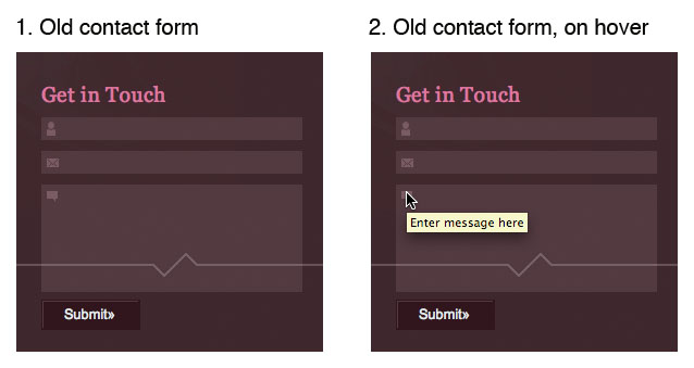
Here’s the previous version of the form:

The good: The heading is task oriented and the form collects all necessary information. All form fields are mandatory but luckily there are only three of them.
The bad: The icons next to each form field are small and low in contrast, so it’s difficult to tell which piece of information goes where. It is not obvious whether the fields are mandatory or not. The submit button label is ambiguous and it’s not completely clear what happens when the form is submitted.
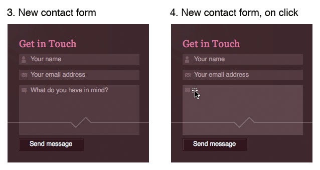
To address the issues with the form fields I decided to apply the Input Prompt design pattern. Jenifer Tidwell explains this design pattern in Designing Interfaces:
“Prefill a text field or dropdown with a prompt that tells the user what to do or type. …
Why: It helps make the UI self-explanatory. … an Input Prompt is a sneaky way of supplying help information for controls whose purpose or format may not be immediately clear.”
I also renamed the submit button to “Send message” to make it clear what happens when it’s clicked. Mandatory fields and form error handling may still cause issues, which is something to address in another post.
Here’s the new version of the form:

Try out the new version of the form on the contact information page.
What do you think? Do these changes make sense?
How could this form be improved further?
Hey Jussi, hows it going? I recon it could be imporved as follows:
Increase the contrast between the text and the background colour and make the icons (for mail, name and message) the sam colour as the instruction text
Instead of “What do you have in mind?” which, as an english language expression, may present a barrier to ESL people, instead give an instruction like “Type your message here” or just “Your message”
cheers
Dave
Hi Dave,
all good, thanks for the feedback! I have implemented most of your suggestions, have a look at the contact information page and force page reload by hitting Ctrl+F5 (Internet Explorer on Windows), Ctrl+Shift+R (Firefox on Windows), Cmd+Shift+R (Firefox on Mac) or Cmd+R (Safari on Mac).
For the rest of the readers: ESL stands for “English as a Second Language” – it’s almost as user-friendly as LOTE (“Languages other than English”) 🙂
Cheers, Jussi
I wonder if “” is better than “Your email address” etc? This clarifies that this text will be cleared upon clicking it, otherwise I think the text might be . I even wonder of “Your” can be left out, as the icons together with the text “email address” are quite self explanatory and a bit cleaner. After all these types of fields are now becoming more common and therefore I believe that there exists a common knowledge by web users that you input your own name (is it called semiotics or icons?). What do you think?
I also think that there should be information regarding which fields are mandatory, since I got an error message when I did not fill in my email address and my comment was cleared when I returned to this page. This can be done by either writing “*mandatory field” in red or other warning color after failure to complete the form correctly and/or an “*” next to “Your email address” and “* mandatory field” at the bottom, especially so that people do not refrain from commenting due to the belief that the have to input a wab page even though they don’t have one. Also, it should be possible to correct ones misstakes, in other words, not lose the information like it currently is set up.
Keep up the good work!
Best regards,
Mattias