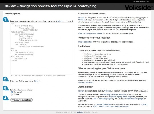
Naview is a navigation preview tool for rapid information architecture prototyping. It helps information architects design and visualise a new navigational structure and aims to bridge the gap between card sorting and IA user testing. Here’s what it looks like:
Using Naview
You can create and edit your information architecture easily in a spreadsheet or a tab-indented text file. You can get a feel for the navigation in just three easy steps:
- Copy and paste your IA into Naview
- Type in your Twitter username
- Click Preview navigation.
Creating your information architecture
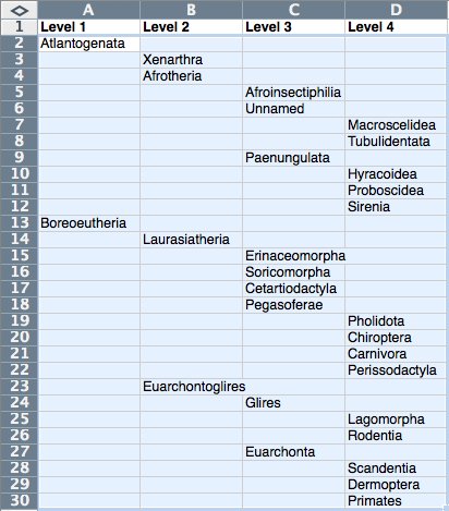
Here’s what your information architecture might look like in a spreadsheet application:

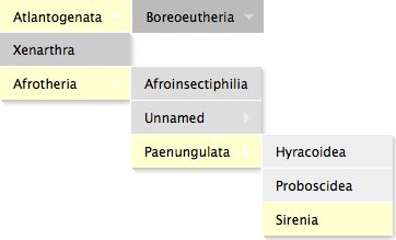
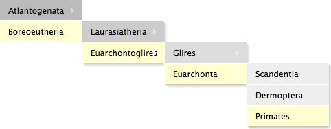
Just copy and paste your IA into Naview and you can easily preview the navigation either horizontally or vertically:
Horizontal navigation preview

Vertical navigation preview

Designed for iteration
Naview is designed to be used iteratively – just click Edit navigation to make changes to your information architecture and then Preview navigation to view it again.
Getting a feel for different navigational structures couldn’t be much more simple!
Example taxonomy
Naview is not limited to website navigation alone and it can be used visualise pretty much any hierarchical structure, or taxonomy.
The example taxonomy above is the Family tree of placental mammals according to molecular phylogenetics from Wikipedia. Here’s a text-only version if you want to try it in Naview yourself:
Atlantogenata
	Xenarthra
	Afrotheria
   		Afroinsectiphilia
		Unnamed
			Macroscelidea
			Tubulidentata
		Paenungulata
			Hyracoidea
			Proboscidea
			Sirenia
Boreoeutheria
	Laurasiatheria
		Erinaceomorpha
		Soricomorpha
		Cetartiodactyla
		Pegasoferae
			Pholidota
			Chiroptera
			Carnivora
			Perissodactyla
	Euarchontoglires
		Glires
			Lagomorpha
			Rodentia
		Euarchonta
			Scandentia
			Dermoptera
			Primates
We’d love to get your feedback
Please take Naview for a spin and post your suggestions and ideas for improvement below!

Neat little tool! It would be great if it were able to split navigation into multiple panels, e.g. like a horizontal nav for the first level and a vert nav for the rest.
Thanks for your feedback Keith! That’s an interesting idea, perhaps something we might address in the future.
Hi all, we have just released the new ‘Kolima’ edition of Naview: http://www.volkside.com/tools/naview/
– You can now share navigation structures with others
– Improved horizontal menu layout, longer labels work better now
– Click-to-expand submenu option
– “White site” preview mode for when you want to focus on the navigation only
There will be a proper blog post about these improvements in due course.
I hope you find Naview useful, please feel free to share your experiences below!